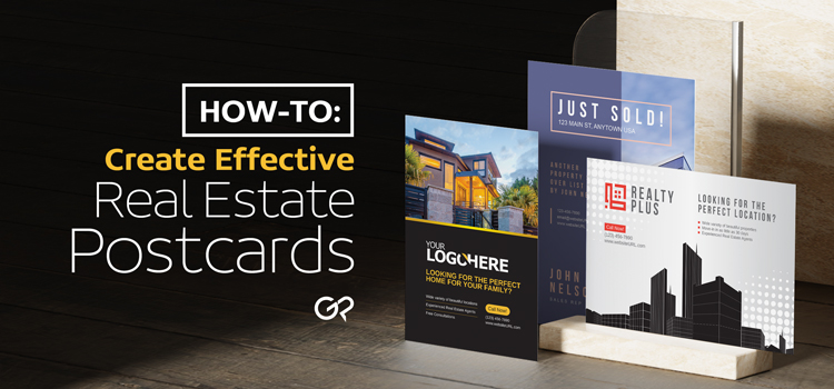
In the world of real estate, not only are postcard mailers popular, but most would also argue that they are a necessity. Real estate marketing, when done right, can get you the exposure you need to drive up sales and provide you with an impressive success rate. Realty is one of the top industries to utilize both digital and print marketing equally to this day, and there’s a reason why.
Why real estate postcards?
Real estate postcards can be used to advertise listings, upcoming open houses, or even just your services.
- They are a quick, easy way to do outreach for any listing or even just self-advertisement of your services
- They can be cost-effective when done right (take advantage of EDDM)
- If you have multiple listings, you can either combine them on one card, or separate them and send them to different neighborhoods based on the vicinity of the properties.
When it comes to the contents and the design of your postcard mailers, you need to be meticulous in your planning. With that being said, it’s not difficult to do! Here are some tips to consider when you’re designing real estate postcards from scratch:
1. Be mindful of color scheme
Keep your design to at most 3 colors, and use bold colors like blue, red, navy, yellow, and green. If your card stands out, your offer is likely to be seen and considered.
2. Simple font styles are a must
Avoid using script or funky fonts, especially for text that’s supposed to grab a reader’s attention. The simplest way to choose a font is to utilize the following: bold, serif or san serif, & large enough to read with ease.
3. Include important details
There are 3 main components that should be included on your real estate postcard:
- The specific offer, so that the direction and purpose of your mailer is focused
- A call to action, so that recipients know what they need to do if they are interested in your proposal
- Contact information, so that clients know where to reach you for questions
Now, the offer and the call to action should come with some sort of incentive, or driving force, as well.
Some additional elements that you should include are your MLS #, any special licenses you may possess that will help push your offer, and the brokerage firm you work for.
4. Use both sides
Printing on both sides of a postcard is actually cost effective. While it does cost more, it’s not significantly more that it’s going to cause a dent in your budget. Look at it this way, if you print on both sides, you’ll have more room to spread out your information and avoid clutter. Plus, when a mailer is only printed on one side, in our opinion, it looks incomplete. Having a well thought out mailer is important if you want your offer to get noticed.
Overall, these tips are not that much far off from the direction of real estate business card designs. If you keep these in mind when making your own postcards, you’ll have the perfect recipe for eye-catching prints.
If you need a little assistance in the design process, we have customizable templates specifically for real estate postcard mailers! Our online design tool is easy to use – simply choose any of the below templates, and proceed to Customize. You will then be directed to the online designer, where you can update text, play around with colors, move the layout around, remove or add elements, and so on. You can even upload your photo or logo to add some additional personalization to the template, which we absolutely recommend doing.
Here are 8 show-stopping, free real estate postcard templates you can use for your next project:
1. “Modern Living”
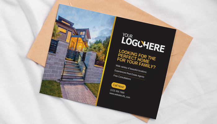
Simple and elegant, with only two colors, your offer will stand out in a pile of mail with this template. Best for for sale postcards, just listed postcards, open house postcards, or general real estate promotional postcards.
2. “Blue Boxes“
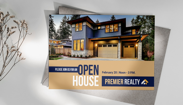
This template provides enough space for your listing’s photo’s to take center stage. Don’t forget to include your own logo for a touch of personalization.
3. “House with Lights“
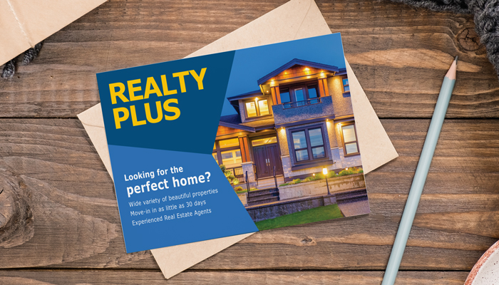
The color blue represents open spaces and inspiration, so a vibrant blue postcard is just what you need to promote any real estate offer.
4. “Modern House“

This clean, sophisticated postcard design is just what you need to advertise your next listing. Be sure to have nice, professional photos taken of the property so that you can use the images for your real estate marketing.
Note: The model agent in every template you see is just a placeholder, you can easily remove it and add your own headshot, or simply choose not to include a headshot at all.
5. “Building Silhouette“
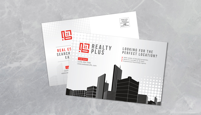
Best for commercial real estate agents, this cool, modern template will allow you to expand your clientele and encourage individuals to contact you for commercial properties.
6. “Abstract Buildings“
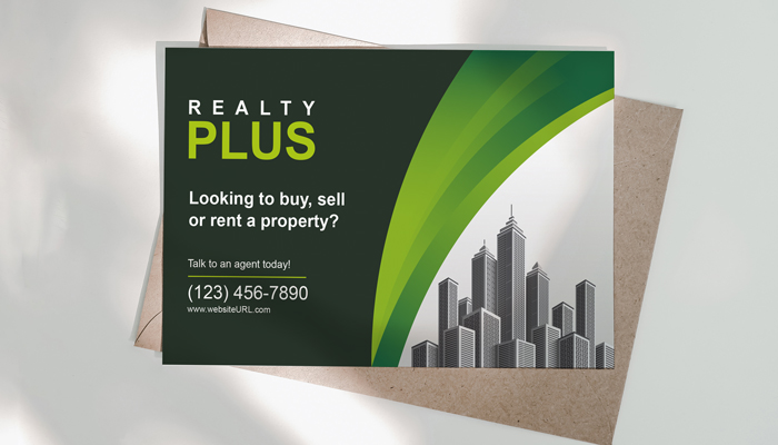
This abstract template can fit the direction of any real estate campaign. It’s versatile and unique, and will surely catch the eye of anyone who comes across one.
7. “Gray Room Theme“
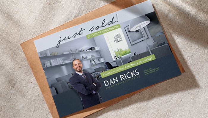
If you want to appear friendly and approachable, customize this template for your next postcard promotion.
Note: The model agent in every template you see is just a placeholder, you can easily remove it and add your own headshot, or simply choose not to include a headshot at all.
8. “Building Outside View“

Let your accomplishments be known! Use this template if you wish to spread the word about your successfully sold listings – this will encourage others to contact you for your services.
Note: The model agent in every template you see is just a placeholder, you can easily remove it and add your own headshot, or simply choose not to include a headshot at all.
Looking for more templates? Browse them all here.
If you decide to use one of our templates, keep in mind you’ll need to have a GotPrint account to save your design and to place any order, so make sure to create your free account with us! If you’re creating your design on an external platform, be sure to format your files correctly in order to upload and order your prints without any issues.
Whether you choose to use a real estate template of ours, or design your cards on your own, we hope these tips and templates were helpful enough to motivate you.
