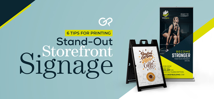
Your storefront is prime real estate for your place of business because it can easily attract potential customers if used properly. Windows, doors, and even curbsides are all valuable in bringing in the traffic you need to boost business. However, it’s also very easy to deter people from entering your store if your signs aren’t designed accordingly. In this blog, we share 6 helpful tips you should follow when creating your own storefront signage.
1. Choose Your Sign Type Wisely
For example, if your business storefront doesn’t have too much window space, or on the contrary, you rely on your window space to showcase and sell your merchandise, then printing a large window decal may do more harm than good. In this scenario, opt for an A-Frame Sign to place on the curb. If you don’t have this capability, your window signage should be at a size that doesn’t obstruct a passerby’s vision of your goods, but also attracts their attention.
2. Use Pops of Color in Your Designs
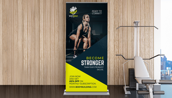
You always want your sign to stand out, especially if its purpose is to entice potential customers to enter your establishment. Using colorful designs that work well with the look of your storefront and its surroundings will grab all the right attention.
3. When it Comes to Text, Less is More
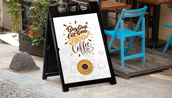
In your messaging, whether you’re promoting a new launch or a limited-time promotion, be as clear and concise as you possibly can. Too much text can be overwhelming on a sign in front of your store and gives little room for questions – half of the promo is the intrigue of it, which will entice customers to enter your store. Also, it goes without saying, but make sure your text has no grammatical or spelling errors, as that’s important in creating a professional presence. No one wants to have to decipher a typo!
4. Be Consistent with Your Branding
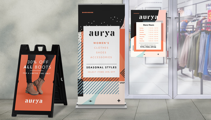
Consistency is essential when it comes to designing signage for your business. Including elements from your style guide – such as your logo, colors, and font type – is the way to go when creating any type of material for your business. This not only shows your level of professionalism but also considers that the more your “branding” is displayed across multiple mediums, the more likely your brand will get noticed and eventually stick.
5. Consider Storefront to Sign Size Ratio for Ultimate Visibility

You want to make sure passersby can read your sign clearly, even from across the street. If you have a large storefront but are printing a standard 11 x 17-sized poster, you’re essentially wasting perfectly good real estate and risking only a handful of people seeing your sign.
6. Simplicity is Key
In both text and design, it’s important that you consider that simple is better because it’s cleaner and easier on the eye. Taking all the previous points into consideration, you should still aim for a sign that’s simple, because the more chaotic something looks, the less likely people will gear their attention toward it.
If you follow these tips, you’ll have signs that will turn passerby traffic into a solid customer base in no time, all while remaining cost-effective. Browse our selection of Signs & Banners to see what’s right for your next project. From Yard Signs, to Banners, to Window Decals, we have it all!