It happens all the time – you found the perfect image, chose a unique font in a size large enough to be legible, yet small enough so that you can squeeze in all the information you can possibly squeeze within that pesky Safe Zone, but there’s still something missing. Sometimes, that missing link is one aspect of business card design that we oft overlook – and a question we have to ask ourselves – do my business cards attract attention?
If the answer is ‘eh’ or a flat ‘no’, it’s always a good idea to go back to the drawing board (well, maybe not all the way back) and pinpoint at least one element of your business or design that you’d like to draw attention to, and how. (If that bright lightbulb hasn’t yet appeared over your head, keep reading for some ideas from our customers.)
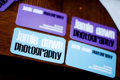
Jamie Dawn chooses a bold choice of color, coupled with an emphasis on her brand name to ensure her cards get noticed.


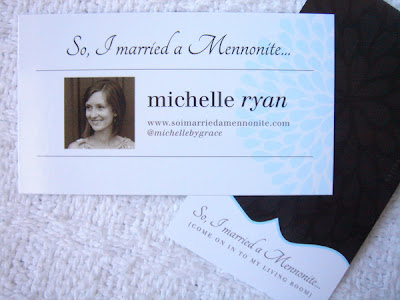
It’s all about the conversation starter for Michelle Ryan, whose blog title, So I Married a Mennonite, is sure to get her a few questions. And to guarantee her client gets a good amount of site traffic, designer Nicole Armstrong makes that very interesting title the focus of attention on the design.
Tip: if you don’t already have an interesting title/brand name, why not create a catchy slogan?

We’re so used to seeing black on white, which is probably why Colin Frost makes good use of inverted color and contrast so that his brand name stays top of mind.
We’d love to hear your ideas, so be sure to comment below.