Dentist business cards don’t have to be boring or plain. The challenge in creating a dental business card occurs in the creative process. You may find it difficult to create a design that captures a patient’s attention or come up with text that makes your services memorable. Look no further, we’ve answered your plea’s and created 8 business card designs for dentists that are fun, creative, and informative!
Business cards are not only useful for keeping at the forefront of a dental office; you can make people notice your practice by placing them in other storefronts around the neighborhood and community. A creative card design will get your cards noticed and picked up right away.
We all know that many people, children and adults alike, can be a little spooked by the idea of going to the dentist. Business cards, believe it or not, can be a great way to alleviate that fear from the minds of many. That’s why we created designs that are inviting and pleasing to look out.
It’s important to let your clients, and future clients, know that your dental office is a pleasant place where dental health isn’t only a priority, but an enjoyable time! These business cards will make it so that patients will be calling in consistently to book their bi-annual cleaning appointments.
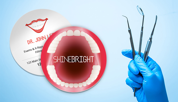
Creativity can be as simple as changing the shape of your business card so that it stands out from the standard template. A circle business card is perfect for a Dentist because there’s a lot you can do with it in relation to the theme. In this design, we’ve turned a circle card into an open mouth for the front. A keeper for sure!
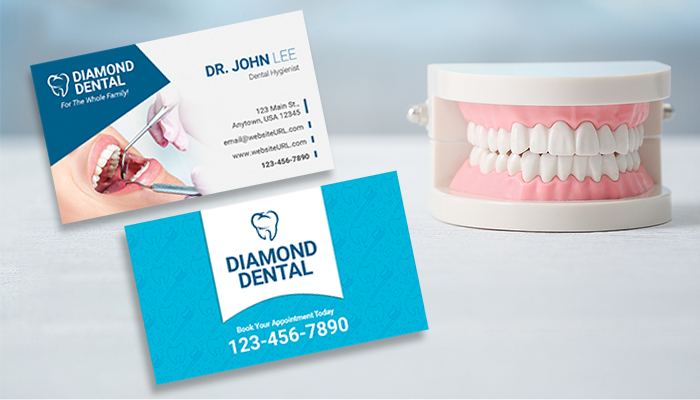
The thought of a “teeth cleaning” can sound intimidating. For this dental hygienist business card, we’ve incorporated a soothing blue color for the theme to induce tranquility. The image used on the front of the card shows a patient with beautiful teeth who is seemingly content. Choosing a model with ideal teeth for your image is a obvious move, we all want perfect teeth! And your hygienist skills will get them one step closer to that goal.
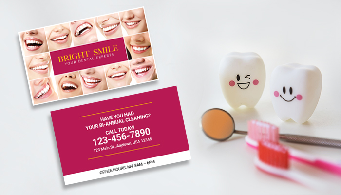
A perfect, bright smile is a goal for many. Make it known that this goal is easily attainable at your dental practice with a collage of photogenic smiles and colors on your card that induce excitement and eagerness.
It also helps to use the back of your business card as a call-to-action. In this card, we are posing the call-to-action as an urgent reminder that teeth need to be cleaned twice a year. Many people forget this rule, but not with a business card like this in their hands!
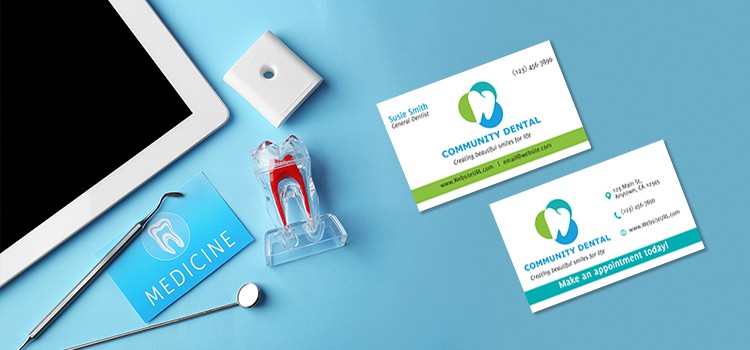
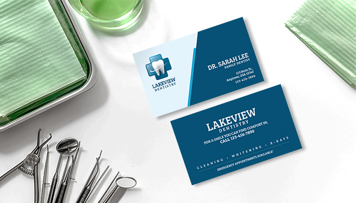
Sometimes nothing is more comforting than a standard, professionally designed business card. In the medical field, doctors and practices often call for something classy and chic. A card like the one above has a dynamic layout with a simplistic color scheme in order to convey a dentistry that is professional in practice. The front craftily displays the company logo and vital contact info, while the back proceeds to convey a reassuring slogan with a short list of some of the services offered. Basic, clean and to the point, just how every patient expects their office visit to be!
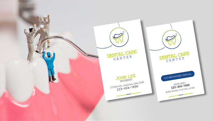
This dental business card is modern in its simplicity. The design is crafty with the layout and the colors. making it attractive to the eyes despite how simple the design is in nature. The selling point to a business card like this is the lead magnet on the back. This particular lead magnet offers a “$30 New Patient Special,” however depending on your practice and what kind of offers you have, you can customize it however you like. The general idea is that a lead magnet will give new patients an incentive to book an appointment at your office. or find out more info about your office. Medical bills are hefty these days, give people a reason to use the services at your dentistry!
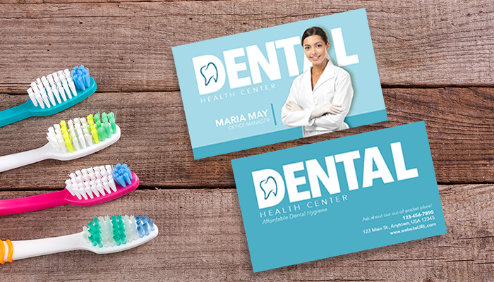
We love a business card with a high-quality profile pic. Adding a human element to your dental card is a step towards establishing trust with patients. For many of us, putting a face to the name is reassurance that we’ll be in good hands. Anonymity can be a bit unnerving, especially in matters as sensitive as dental health. If you choose to go this route with your cards, use our design as an example of what is appropriate.
A bad quality photo will only harm the point you’re trying to make, so make sure the photo is taken professionally and printed on quality paper with glossy coating. It’s also beneficial to be aware of how the photo looks against your cards background color. In our card, we assessed that this dentist, with her white lab coat, would contrast nicely against the gentle blue background. Spending time on these kinds of details will make all the difference in your business.
If you specialize in pediatric dentistry, this fun cartoon-esque business card will do the trick. Kids love cartoons, that’s a fact. Their parents will most likely be on the lookout for a dentist that is child-friendly and inviting. Our business card shows a tooth as a super hero for its logo, and a slogan that is confident in its practice.
We also find it helpful to make more than one use out of your business card. Our example suggests doubling your card as a referral card. Rewarding your patients for referring people will draw in new patients, while keeping your current ones happy.
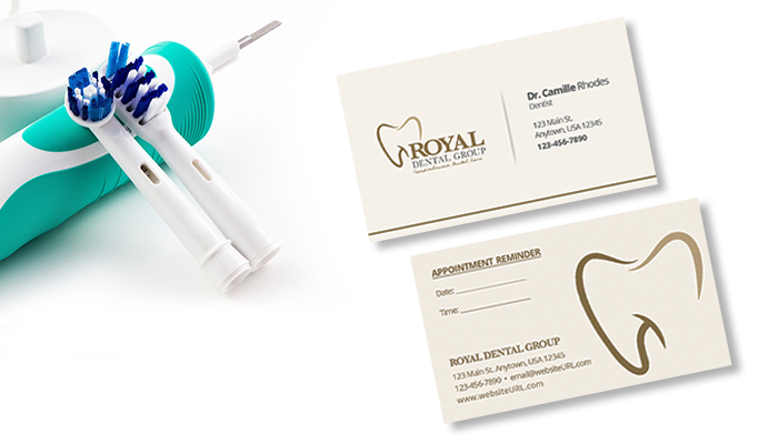
This card design continues on the topic of using business cards for multiple functions. In this dental card, we’ve doubled it as an appointment reminder. This design option is a no-brainer, and probably the most popular among dentists. When going with an appointment reminder card, there are a couple of things you should keep in mind. A simple design will avoid overcrowding the appointment reminder section. You don’t need too many details on these cards, a simple logo with your contact info will suffice.
Make sure you print these cards onto a matte finish card stock so that you can easily write the dates and times right onto the card. Making these cards glossy will defeat that purpose. You can upgrade them to a 16pt or 24pt trifecta thick paper for added thickness, durability and sheer class.
For more dentist business card design inspirations, click here. Are you a dentist with a well designed business card? Send us photos to socialmedia@gotprint.com for a chance to be our Customer Feature of the month!
