Revamping your business cards to match your business identity doesn’t necessarily translate to adding more color, design, and embellishment. As the minimalist motto goes, less is more, especially for spreading brand recognition. But don’t think that simply adding contact details and leaving the rest of the card blank will do the trick. For a truly effective design, one needs to incorporate a little bit of creativity and connect the design to the company identity. Below are three powerful designs that caught my attention with their sheer simplicity, symbolic designs, and clear message.

At the beginning of the year, it was time to freshen up our business cards to match the newly refreshed website. We are a camera cleaning and digital rescue company, so were looking for something which looked clean, sharp and also reinforced our name.
Thanks to Mauricio, (one of our Graphic Designers here at Rocket) we ended up with a very paired down look, just black & white, with straightforward graphics.
Keeping with a very clean look, we went with the 16pt matte card stock. It has a nice weight to it with no reflection. Only one color was used so as to match the Rocket website.
-Oliver Christie of Rocket New York
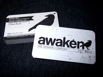
Somehow, I’m completely awake after looking at this business card. The contrast of the black and white emphasizes the brand name, and the symbolic bird is unmissable.
In 2010, we did a total 180° with the branding of our company and our business cards/print material got a nice little revamp as well. We went for a sophisticated feel, while still letting our design relate to the many different genres of clients that we have. GotPrint rocked our printing as always, they’ve printed our material since 2008 and we refuse to go elsewhere!! GotPrint all the way!!
-Anthony of Awaken Company LLC
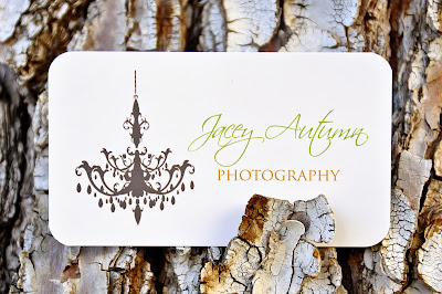
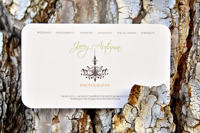
My inspiration behind my card design was simply chic and classic, yet true to myself. I believe that things that are easy on the eye are appreciated and translated best. My goal was to be able to catch one’s attention by the elegance of the design, and I was able to achieve that goal with GotPrint’s great service. I wanted to create a design that correlated with my photography which is clean and classic as well and I couldn’t be happier with the results. Thank you GotPrint!
-Jacey Autumn Photography