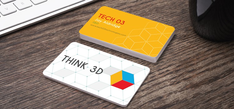
Most of us learn that you never get a second chance to make a good first impression. This statement still holds true today, both in our personal lives, as well as our professional ones. Whether you’ve attended a networking event, business meeting, conference or countless other professional settings, chances are you’ve given out or received a number of business cards. Which ones stand out? Is it yours? It’s easy to notice the ones that do, as they usually incorporate a combination of some of the following features: bold colors, taglines, beautiful images, unusual shapes or a textured card stock.
It’s a given that all of us want our first contact with a potential customer to turn into a lasting impression, which is why turning your business card into a dynamic brand ambassador is essential. Below are a few simple ways to make your business card stand out.
Bold Colors and Taglines
Don’t be reluctant to use bold colors that jump off the card. If you have a company logo or color that you’ve been using for a while, think about adding some vibrant accents. The key is to not make the card look too busy. For professionals such as accountants and attorneys, a minimalist approach is sometimes best: use a white card with simple text that provides the necessary contact info along with your logo. Then add a tagline or catchy slogan on the back of the card to communicate your services in a memorable way.
Another approach is to use only one or two colors that are easily recognizable within your industry. For instance, soft greens and blues most commonly denote healthcare. A wide spectrum of blue symbolizes the financial sector as well, whereas products or services offered within the environmental industry use shades of bright green and brown. Also think about printing multiple sets in different colors and creating a different tagline/slogan for the back of each set of cards. With the low cost of printing business cards today, there’s no reason to be locked in to one particular color or line of text.
Beautiful Images
We all live in a visual world. Images are always noticed before text. Go beyond the logo. Don’t be afraid to show off your products, services or people in a meaningful way. Consider using an image on the back of the card. For greatest impact, bleed the image on all four sides. A good example of this technique is often used in real estate, with contact information and the realtor’s picture on the front and a beautiful image of a home for sale on the back. This technique also works well for any products or services you would like to promote. For instance, a photographer or designer might want to use one of their favorite images on the back of the card as a clear representation of what they can do for potential customers. Essentially, you’re turning your business card into a mini-brochure. By using beautiful images, you’re more likely to make an evocative connection.
Textured Card Stock
Paper stock can provide a significant impact on how the business card is perceived. There are numerous different types of paper stocks available, from glossy and matte thick card finishes to linens and heavily saturated colored papers, UV coating and more. Stay away from printing your card on thin stock such as 100lb paper. It will be flimsy and not provide the great first response you should achieve when handing them out. A minimum of a 14 pt. or 16 pt. point card stock is highly recommended, as is a textured card stock such as our 38 pt. Trifecta Black – Triple Layered Ultimate. A Trifecta card is sure to up your brand ante significantly.
Unusual Shapes
With business cards, thinking outside of the rectangular box can reap immediate rewards. For example, using rounded corners for your cards will enhance the design greatly and certainly make it stand out, regardless of whatever else you do. Plus, it adds little to the cost of printing. There are also many other unusual shapes from which to choose including ovals, circles or customized shapes. For example, ovals and circular shaped cards are perfect for arts and entertainment-related businesses. They add an extra touch of creativity to your card. A customized shape designed as a house is memorable for realtors, while a card in the shape of a key is spot on for locksmiths. The possibilities are endless. There’s no reason not to try an unusual shape. Go for it. It will pay off.
Discover a new look for your business card today by visiting our website at GotPrint.com.
About the Author:
Rob S. has more than 20 years experience as a content marketer and creative director. He has worked in a wide range of industries and enjoys creating content for various areas in the digital world: from social media, to online ads to website copy. Rob enjoys art, music, taking photos, managing his fantasy baseball team, staying fit, and of course, spending quality time with loved ones.
