Brochures are promotional staples that have long been used by businesses to display large amounts of information regarding their products and services in a neat and organized manner. Although we are all familiar with the conventional tri-fold versions that we find in waiting rooms, public institutions, and travel companies, brochures are versatile enough to be used in just about any industry. Whether you need a trade show handout, informational pamphlet, or takeaway menu, these tips will help you design an enticing brochure that potential customers won’t be able to resist.
1. Plan out the brochure layout before you begin designing
A multi-panel brochure is much more time-consuming to create than a flat postcard or flyer with minimal text. Before you start setting up a print-ready file, take some time to finalize the following components:
- Color scheme – If you already have a color palette that you use in your branding, you obviously want to stick with those. Otherwise, find a color scheme that will best complement your business (e.g. bright, bold colors for fast-casual restaurants, muted earth-tone colors for spas and luxury hotels, and classic combinations like white, black, and red for traditional services such as banking).
- Fonts – Your fonts should be simple and easy-to-read. Stick to 2 or 3 classic and versatile fonts like Helvetica or Georgia and use script fonts sparingly.
- Content – Write out all the text for each panel on a separate document so you can copy and paste as needed.
- Images – Gather high-resolution versions of all the photos and graphics you plan to use within the brochure.
When you’re ready to start designing, make sure to download the correct brochure template for the size and fold you plan to order. A well-made template will have clear markers for each panel as well as trim, safety, and bleed guidelines to help you figure out the best placement for your text and images.
2. Each brochure – and panel – should have a clear purpose
A brochure is one of the best ways to display a comprehensive overview of your product or business in a neat and organized manner. In order to increase your chances of readers taking a desired action, make sure to clearly define the overall goal of each brochure as well as each panel within the brochure.
When potential clients or customers are perusing brochure display racks, you want to quickly grab their interest and make it easy to find something that appeals to them. Keep the cover simple, with the text limited to the bare minimum needed to convey the brochure’s subject matter. Each panel should have a clear header such as “how to order” or “contact us.”
3. Keep the overall design simple and clean
One of the more common mistakes we see is business owners wanting to use every inch of space on their promotional materials. While that is understandable, using too much text and too many design elements can result in a printed piece that not only appears cluttered, but confuses and overwhelms the reader.
When designing your brochure, try to stick to no more than 4 colors and no more than 3 fonts. Don’t be afraid of white space – when used correctly, it makes adds emphasis to your text and makes the information easier to retain.
4. Have fun with different brochure folds
The folds are what separate a brochure from other types of print marketing materials. Use them to your advantage by utilizing a unique fold for each type of brochure you make. For example, if you own a restaurant, you may want to use a larger half-fold menu for your dine-in customers, but offer more compact tri-fold menus to place in delivery and take-out orders.
Other popular folds include:
- Z-Fold – Perfect to present different services or products on separate panels. Nonprofits can also use these to display various donor levels.
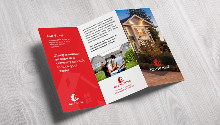
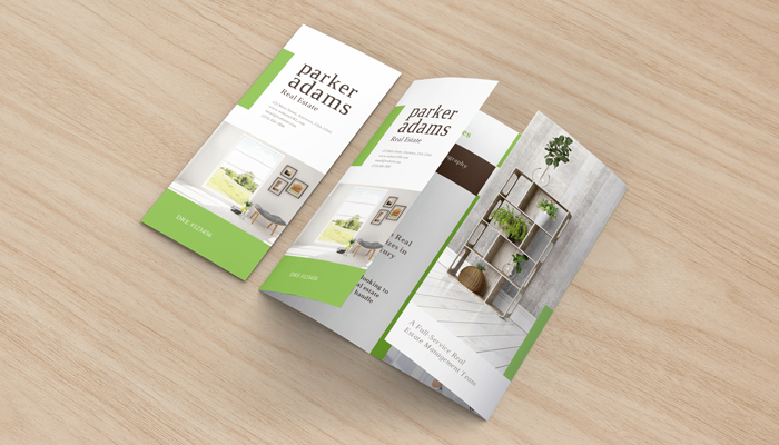
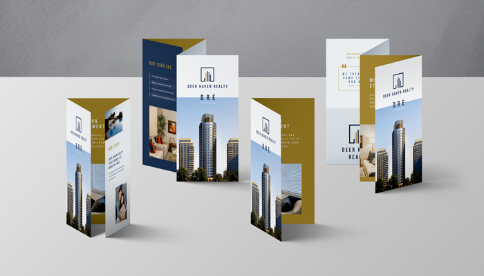
- Open Gate Fold – Real estate agents love using this fold to showcase their listings – feature a gorgeous exterior shot on the cover and stunning interior images on the inside.
- Closed Gate Fold – This fold is similar to an open gate brochure but with an additional final vertical fold. Perfect for retail store grand opening invitations or even personal birthday party invitations!
- Accordion – Similar layout to a Z-Fold brochure but with an additional panel. Perfect for companies looking to recruit new employers or investors – use one side to present a timeline of significant events and milestone dates.
- Half Fold then Tri-Fold – Use this 12 panel brochure for more comprehensive topics or subjects. These are especially popular with amusement parks and other venues, as they can unfold to reveal a large map.
5. Choose the right paper stock for your brochure
Not surprisingly, many GotPrint customers choose to print their brochures on our high-quality gloss cover stocks. After all, a glossy finish is known for having a beautiful sheen that helps protect your product and makes colors appear rich and vibrant.
However, a glossy brochure may not always be the best choice for your business. If your brand’s aesthetic is vintage-inspired and soft, then a matte paper stock may better reflect your company’s image. If you are printing brochures with questionnaires, surveys, or other interactive material, our uncoated paper stock is the ideal choice due to its writable surface.
Bonus Tip: Evaluate each brochure’s effectiveness
If you’re printing numerous brochure designs, it’s likely that certain ones will be far more effective than others. Set up a unique coupon code, email address, and/or extension for the different brochure types and track which ones deliver the highest returns!


