What are the top three branding logos that pop in your head? Chances are that big name brands like Nike, Amazon, or Starbucks are a few on your list. If you’re starting a new business, there’s no doubt that you’re eager to gain the secret to creating a logo that will leave as big of an impact as the Nike check mark does.
If you’re not a professional designer, you may find yourself completely stumped when it comes to thinking up logo ideas. Even the most simple logos you know and love probably took hours, or even days, of brainstorming different concepts and ideas. There’s no cause for panic though, because we have compiled a list of hot tips for what to do and not to do when it comes to the basics of designing your logo.
Once you’ve got these tips under your belt, you’ll have solid knowledge that will help you get started on creating an effective logo, destined to go viral!
1. Don’t Use Gradients in Logos
It’s true that gradients can look really cool thanks to the optical effect they leave with different shades and textures of color. But you need to be practical and logical as much as you are creative when it comes to designing your logo.
The truth about gradients is that they cause too many complications and limitations, especially when it comes to commercial printing. The patterns may look attractive but when reduced to tiny proportions, they fall apart!
If your logo MUST have a gradient effect in it, then make sure to have another version of the logo in a simple 1-color file, so that you may easily adjust it for any medium and circumstance.
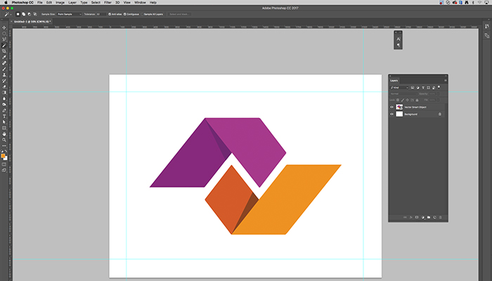
2. Use Vector Format
Using Illustrator to edit a Vector logo is far easier than a pixelated (Raster) image and most importantly, these files look best when printing. If you need to zoom in on your logo, it will start to blur if it’s a Raster file. Since Vector files are made of mathematical calculations that form lines and shapes, your image appears clear and crisp in any situation.
- Vector files include: ai, .eps, .pdf, .svg
- Raster files include: .jpg, .gif, .png, .tif
3. Tweak to Add Personality
Logos can take on a life of their own if they are crafted creatively and in a clever way. We suggest playing around with the design and/or letters to create an appealing shape / image.
A good example of this is to create a double entendre – an image that has two pictures wrapped into one through a clever concept. This trick to the eye will make people appreciate a design and remember your brand because of it.
Whichever way you decide to tweak your logo, never forget the most important rule, which is keeping is simple. Creating your logo can become so time-consuming that we tend to forgot, the logo isn’t the entire story of your brand, but rather a unifying thought. Less, is more!
There are many ways you can create a double entendre with a letter and a shape. For instance, if you are a yoga brand, you can create a yogi figure out of a variety of letters. The possibilities are endless!
4. Use Shape Psychology to Rely Emotional Connection
Different shapes have special meanings in society, we can see this if we look closely at the shapes different companies choose to represent their brand and why. For example, curves suggest strong movement, so a sports company like Nike came up with their famous Nike Swoosh mark.
Shapes should correlate with your industry so that it makes sense. Using shapes to your advantage will help elicit an emotional response in the audience. A skilled logo designer will use certain shapes to infer a special quality about the brand, but a little research will help you become an expert on shape psychology. Below is a little cheat sheet:
- Circles and other round shapes project a positive emotional message suggesting community, friendship, and unity.
- Any shape that has curves or are asymmetric usually implies objects that are found in nature such as: trees, flowers, clouds, and earth.
- Squares, rectangles and other shapes with four corners represent: uniformity, stability, security and honesty.
5. Smart Use of Negative Space
Negative space sounds scary, but it’s actually your friend and can help your logo gain popularity. Negative space has the power of making your logos look clever and leaving an impression. For example, brands like FedEx subtly use negative space by creating an arrow in the white space between the “E” and the “X”.
There’s a lot of competition between brands these days, the logos that truly leave a mark are ones that are unique, creative, and original. Utilizing negative space to create an illusion of dual imagery will “Wow” your audience, every time!
According to the experts at Design Shack, “When it comes to negative space logo designs, agencies can incorporate multiple meanings in to their logo designs. It’s a great way to capture a customers attention, and make them think twice.”1
6. Understand Your Colors
No matter how colorful you intend on making your logo, it’s pertinent to understand what kind of emotional response each color entails, just like in shapes. Gain knowledge on primary colors and the associations each color carries when considering them for your logo.
The colors you choose should enhance the value of your brand, and depend on the industry. For instance, if you want to promote anything that’s eco-friendly, it’s only natural to stick with the colors green, blue, brown or yellow.
Choosing a color isn’t the only measure you need to be cautious of. Once you’ve chosen your colors, you need to make sure you know the difference between designing a color logo for web vs for print. If you aren’t aware of the differences, your logo could end up looking a different color when you print them.
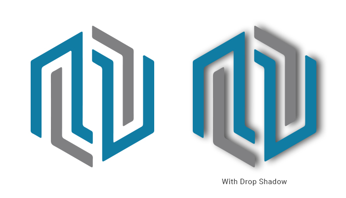
7. Eliminate Drop Shadow
Drop shadows are controversial when it comes to your logo designs. They look nice on web, but sadly they look bad in print. Not only that, but they also make for very heavy files. If you were considering adding a drop shadow to your logo, it’s better to simply drop that idea.
Often times, it can end up giving off a tasteless lighting effect. They “Add Visual Clutter around the letters and around the words. They fill up the white space that is between and around the letters,” according to the experts at Overthinking Design.2
If you’re married to the look of this effect, there are better alternatives to drop shadow, such as blending the logo in with the background.
8. Make Sure You Logo Can Scale to a Variety of Sizes
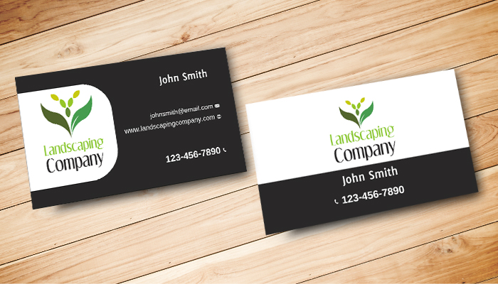
You never know where your logo is going to be placed, whether it needs to be subtle on a business card, or larger on a poster or postcard. Your logo should be flexible enough to adjust to any size, since they work best when they can be used on multiple mediums and fit any space. So don’t make the rookie mistake of creating a small file.
When you’re creating your logo in a program such as Illustrator, keep your file at a high resolution such as 300 dpi or higher. You’ll want the resolution to be high because the quality of your logo is retained when shrinking. Enlarging a small file results in the loss of quality.
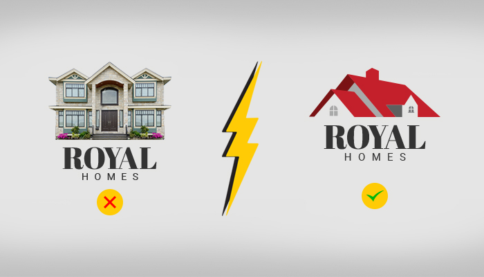
9. Don’t Use Photography In Your Logo
Aside from looking too tacky, photo-based logos are too difficult to reproduce. They detract from the flexibility and adaptability of the logo, and the printing process can cause too much grief. That’s why we recommend sticking to illustrations when it comes to logos. That way your logo will be sleek, simple and to the point. You’ll never see a big brand with a logo that uses an actual photograph with it.
10. Choose Appropriate Fonts and Typography
This tip should be obvious, but you’d be surprised how many people tend to neglect using the appropriate fonts and typeface in their logos. Just like colors and shapes, the typography in your logo should be based on your target audience. For instance, brands associated with formal themes do well using cursive fonts. Many other brands stick with a sans serif font to stay minimal.
However, if it’s appropriate for your industry, you shouldn’t be afraid of using a serif font in your logos. As long as the typography makes sense to your brand, you can be as stylish, luxurious or traditional as you feel is right.
1- https://designshack.net
2- http://overthinkingdesign.com/2015/01/when-to-use-drop-shadows/
