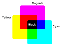
Achieving accurate and consistent color is vital for not only aesthetics, but for establishing and maintaining brand identity. But if your approach to getting the right color is much like how you would play an amateur game of blackjack–simply hoping for luck to strike–consider yourself doomed.
 In fact, achieving the right color requires a good deal of precaution, knowledge and management, starting from the file preparation stage, all the way to the printing stage.
But alas, it may be easier said than done. We know that preparing your color files and getting the color just right may seem impossible to some of you at times, leading to frustration and a whole lot of hair loss, we expect. After all, it can get complicated, particularly if you don’t know the fundamental dos and don’ts of design.
So as your promotional experts, we’d like to make the designing process simpler and less stressful for you. (After all, we don’t want you to lose your hair.)
To help you do this, we’ve created a document with different color management tips that we hope will be a great help for you during the design stage and beyond. It’s just a concise, three pager (most of which are detailed instructions to converting color), so it should be a fairly quick read!
And if there are any concerns or questions we haven’t covered in the document, please leave a comment below and let us know.