Never underestimate the power of a business card. When you have something as compact and memorable as this piece of card stock, it’s important to measure its value based on how it’s designed, and what information is included on it. Many of us have personally received some poorly crafted cards and can tell you that they’ve either been thrown out or forgotten about. Yes, human interaction in a scenario of networking is important, but we can argue that a business card is the most important, as it leaves the “last” first impression of the person you’re giving your card to.
We talked to some of our in-house designers, who helped us come up with a cohesive guide to creating the perfect business card. Whether you’ve hired a designer or are dabbling at designing a business card yourself, it’s important to be aware of what works and what doesn’t. With these clear-cut tips of dos and don’ts, you’ll be on your way to having a perfectly designed business card!
Research:
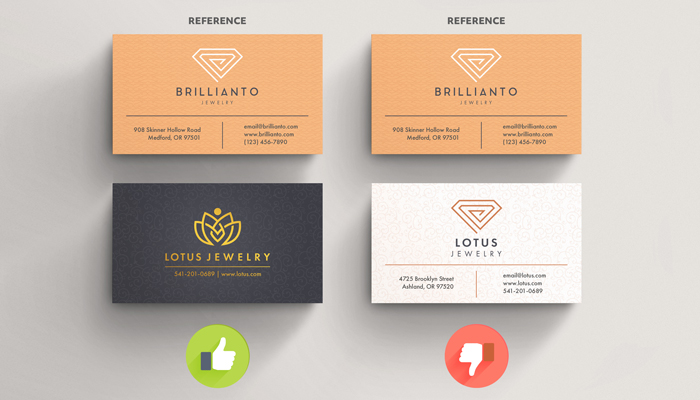
Conducting thorough research means you’ll be taking bits of inspiration and ideas from different channels to come up with your own design and concept. GP Designer Arnold D. says, “Research & critical thinking is a large part of the design. Be sure to have a solid understanding of your target audience & visually appeal to them with complementing colors, the right imagery and/or illustrations, and have just the right amount of text to communicate the correct message.”
Do:
- Look into other designs on the web in regards to the category you will be designing. Real estate, Restaurants, etc.
Don’t:
- Go with the first idea you see or copy something identically.
Fonts:
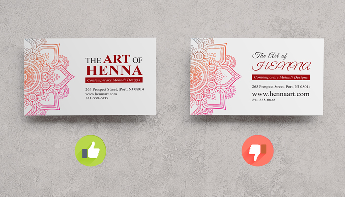
Do:
- Make sure text size is large enough for anyone to read
- Use a font case with multiple weights to help with information hierarchy. Condensed, Light, Regular, Semibold, Bold.
Don’t:
- Use several font cases. Keep it to 2, 3 at the absolute most.
- Use script fonts in all caps.
Information:
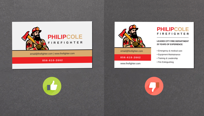
GP Design Manager, Shanna R., notes, “If the design is crammed with too much info, not only will it be hard to read and difficult to find the necessary information quickly, it doesn’t leave room for possible customers to write notes on the card. Also, spellcheck is VERY important!”
Do:
- Include essential information like name, title, company, phone number(s), email, website
Don’t:
- Include excessive information like years worked, experience level, etc. This is what a resume/portfolio is for.
Note: You can include the year the company was established, years worked refers to an individual and their time at a given company.
Design:
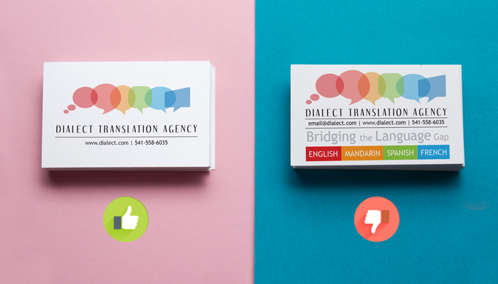
“Plan the design, sketch a visual, and then execute the artwork using creative ways to show your personality. Remember there is not a lot of room for a business card so make sure to have a nice contrast to emphasize what is important for you and your business. Use white/negative space as part of your design. Don’t try to fill up the whole card. Keep it simple and straight to the point.” – GP Designer, Danilo D.
Do:
- Consider leaving white space to make your designs stand out.
Don’t:
- Fill up the whole card with content/graphics. You have two sides to your business cards, using both sides will give you maximum impact, rather than cramming everything (design and text) on one side.
Logo:
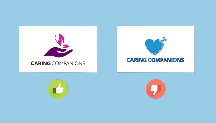
Do:
- Make your logo visible. Make sure the design is clean and concise and represents your brand across all platforms. Make sure it’s modern and eye-catching.
Don’t:
- Use an outdated logo. If your logo needs some revamping, we suggest you do so before creating new business cards.
Images:
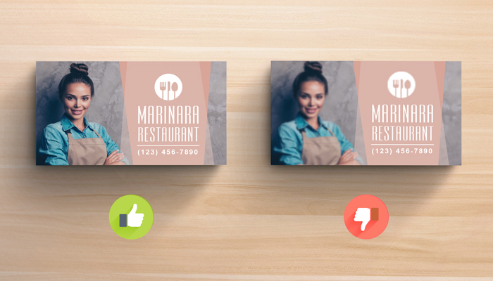
If you are going to include images,
Do:
- Use high resolution images or vector graphics so quality is always high. Make sure your original image/graphic is 300 – 350 dpi (dots per inch) or ppi (pixels per inch).
Don’t:
- Use low-quality images from the internet that would show up pixelated or blurry in your final print.
- Use any old image online, as you may be subject to copyright infringement
- Utilize random clip art images from Google and call it a day. Designs should be personalized to the best of your abilities.
Print Files:
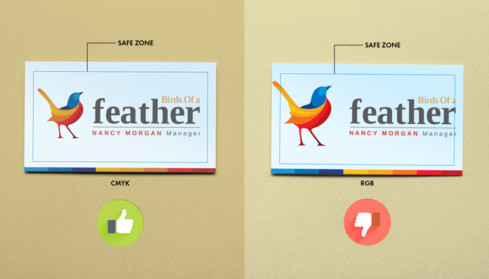
Do:
- Use our templates to give you the correct resolution, size, and bleed to print the perfect business cards.
- Make sure your files are converted to CMYK color mode, as colors will not print the same way they are shown on your screen (RGB mode).
Don’t:
- Increase the size and/or dpi values of your image.
- Use a border in your design, as you risk your final prints being off-centered with an uneven border.
We’d love to see your final products! Send us a photo or post it to your social sites and tag us for a chance to be featured.
As always, follow us on social media (Instagram, Facebook, Twitter) to gain inspiration for designs or to ask questions. @GotPrint
Happy designing!
