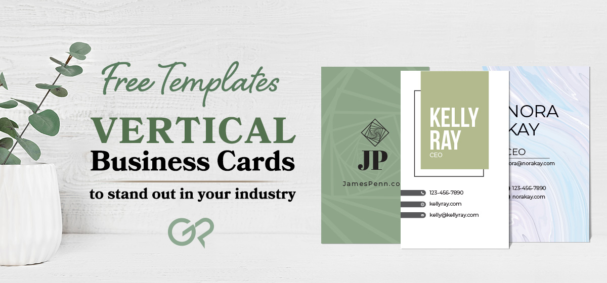
Business cards have remained a staple of professional networking for decades, and it’s not hard to see why. All you need to create the perfect card is:
- Your Name
- Phone Number
- Email Address
- Job Role
- Any other information you want to share with contacts.
After that, all you have to do is select a template or design that complements your unique brand, choose your paper, and place an order for as many cards as you require! As simple as business cards are though, you can still select unique designs or layouts if you want to stand out from the crowd, one of which is a vertical orientation.
Vertical business cards are a rarity within the marketing industry. While some may take that to mean they are less useful, the opposite is often true. Business cards are about leaving an impression and access to information so prospective clients or customers can follow up.
Free Vertical Business Card Templates
Vertical business cards offer a unique and eye-catching option that sets them apart from standard landscape business cards. When well-designed and partnered with the right company or personal brand, they can become an effective and memorable option.
Not sure how to use vertical business cards within your own industry? Here’s a look at some of the wonderful free templates that our design team at GotPrint has created for you!
Minimal Dot
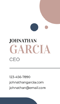
With a vertical business card, it’s important to keep the focus on your name and basic information. Whoever you hand this card to is already going to be surprised by the orientation of the card itself, and you can trust that impression to make your cards memorable. A few splashes of color from our Minimal Dot design are all it takes to pull the production together and give you a card clients won’t soon forget.
Hypnotic Circles
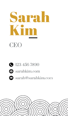
Simplicity doesn’t mean you can’t play with patterns though. Our Hypnotic Circles Design combines intricate swirls with a masterful use of blank space to create business cards that catch the eye but remain easy to read and understand.
Abstract Square
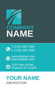
Vertical business cards also make it easier to highlight more typical designs. Our Abstract Square design wouldn’t stand out too much in a horizontal layout, but when positioned vertically, the company name and logo are presented far more dynamically. The middle third block also allows for easy-to-read information, while the white block at the bottom will make it easy for customers to always remember your name.
Minimal Linear Design
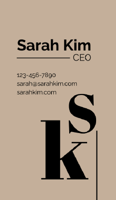
Branding is often all about making a strong impression. With our Minimal Linear Design, you can be sure that your information and initials will stick in the mind of whoever you hand this vertical card to. While some of their information may be smaller and require a few extra moments to read, the large title and larger initials do the work of remaining eye-catching and memorable for the rest of the card easily enough.
Minimalist Rectangle
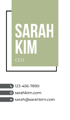
Creating a unique layout with a vertical business card is also a great way to play with design. The offset squares of our Minimalist Rectangle cards frame the vertical orientation in an aesthetically pleasing way while also leaving the smaller bullet points at the bottom as an easy way to spell out necessary follow-up information.
Minimalist Geometric Triangle
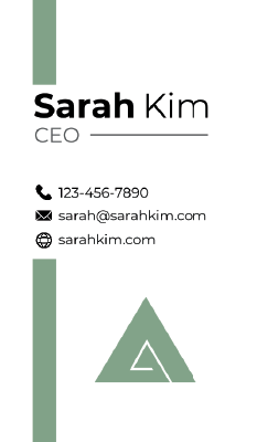
Similar to our minimal linear design but with a bit more of a focus on design and artwork, our Minimalist Geometric Triangle cards offer a clear space for information and networking while still highlighting your creativity and aesthetic focus. Perfect for a graphic designer, artist, or any creative field, this vertical business card creates a clean layout to promote yourself.
Minimalist Marble
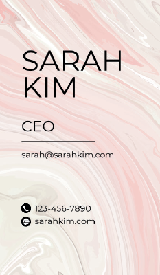
Plain space has its time and space, but sometimes a delightful array of colors and design is just what the business card ordered. Our Minimalist Marble design would be colorful, loud, and noisy if it weren’t for the subtle and subdued colors chosen. The soothing pattern also makes a perfect backdrop for all the contact information you can fit on this vertically aligned business card.
Modern Abstract Shapes
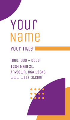
There’s nothing wrong with a bold pop of color though, you just have to be careful about its placement and function. Our Modern Abstract shapes card takes complementary colors and creates offset half circles to guide the reader’s eye across whatever information you have. Utilizing blank space to present your name in both chosen colors and the whole vertical presentation together.
Rounded Abstract Shapes
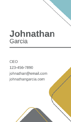
The Rounded Abstract Shapes design uses a similar offset technique to our minimalist rectangle cards to frame your vertical business cards without covering usable space. The use of three colors instead of the more typical due tone also creates a palette, a color scheme you can choose to lean into with your other marketing materials if you so choose.
Spiral Design
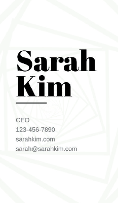
Wrapping up this array of vertical designs is our Spiral Design. By using the entirety of the business card’s space with a more subtle and faded design, this layout leans on expression and presentation to leave an impression. Your information won’t be difficult to make out either, as the bold black font is guaranteed to be clear and legible over the creative artwork in the background.
Which Vertical Business Card is Right for You?
Whatever industry or brand you want to promote, vertical business cards can offer a creative alternative to help leave an impression. When combined with the right layout and information, a vertical business card can actually be more effective than the traditional horizontal shape. These kinds of cards can often come off as less traditional and more contemporary. If you want an attractive and original design for your contact info, a vertical layout is an excellent solution.
